Assignment 4: Stress Relievers

Stress is something everyone experiences and struggles with. We understand how difficult it can be to cope with stress, especially when you feel alone. Therefore, we have put together three methods of stress relievers that you could use. Keep reading for more information on stress relievers such as meditation and ASMR.

After learning and interacting with the materials, students should be able to:

  • Have a broad understanding of introduced stress relief methods
  • Describe the basics of meditation, guided imagery and ASMR videos
  • Know how to meditate with their body
  • Know the step to do guided imagery
  • List examples of ASMR tingles
  • Explain how to utilize the de-stress methods and how may they bring relief

Meditation – Meaghan Leong

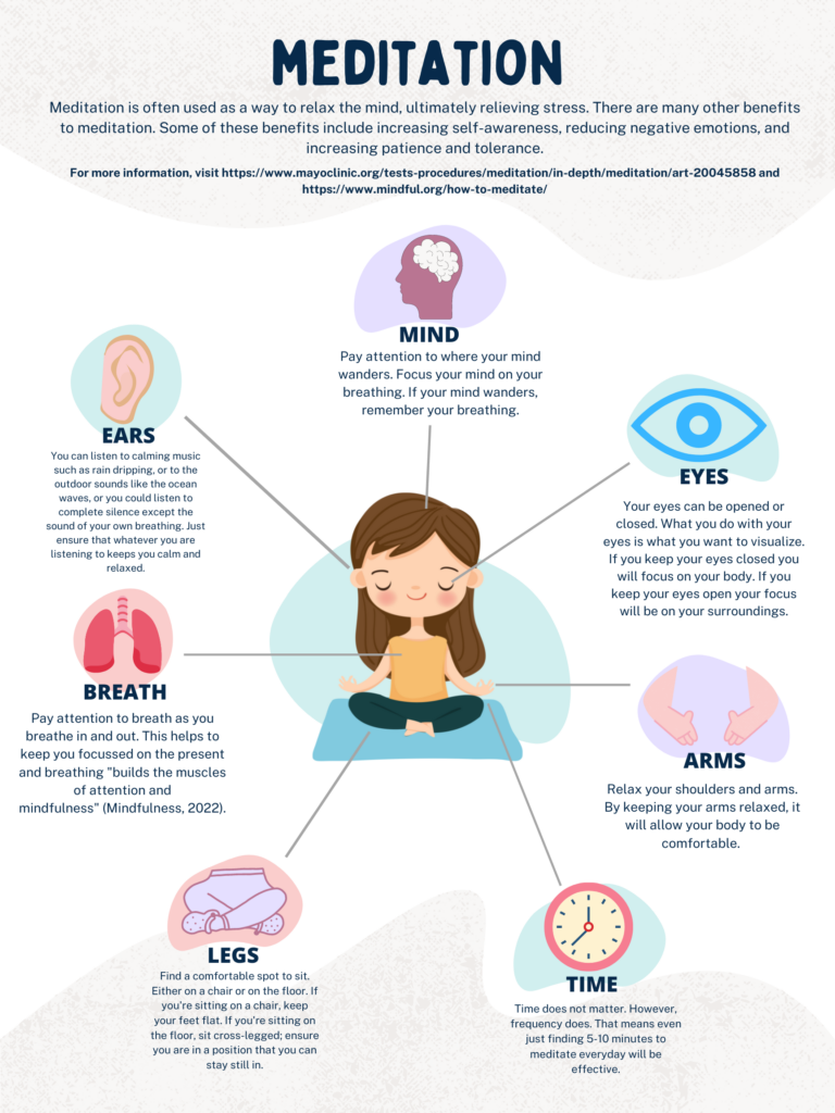
Meditation is a great way to relieve stress which focuses on our breathing, mind, body position, sensory skills, and time.

LEARNING OUTCOMES

After this subtopic you will be able to:

  • explain what meditation does and why it is beneficial
  • demonstrate how to meditate
  • list the 7 main components of meditation
  • lead a meditation session for the class
Meditation Canva poster designed by Meaghan Leong (2022)

Implementing Multimedia Learning Theories

I chose to use a Canva poster to represent the physical aspect of relieving stress, in specific, to teach meditation. My poster follows the Personalization Principle, in which I used first person language to catch the attention of my learners. I also followed the Redundancy Principle by recognizing that less is more. Therefore, although I have both images and text, my images only help a learner to comprehend which part of the body I am explaining. As well, I included the Coherence Principle, in which only two choices of media is selected (text and images). My text is all near each image that represents the information and they are all placed in the same way. For example, for each section, first I display the image, then the subtitle of the section (i.e., Arms), then the text which describes that subtopic. By following these principles, my student might be able to learn better and will find my poster easier to follow. An important design aspect I included followed Adobe’s 8 Principles of Design. One of the most important design aspects I included was “colour”. I thought this was most important because meditation often represents a calm mind. Therefore, I chose light pastel colours throughout my poster that would help set the mood for my learner while reading the information provided.

I also found a video called Ten-Minute Meditation for Beginners (linked below) that goes really well with my designed poster for those who prefer to follow narration.https://www.youtube.com/embed/U9YKY7fdwyg?feature=oembedRetrieved from https://youtu.be/U9YKY7fdwyg

I included this video Ten-Minute Meditation for Beginners because I think it allows for an inclusive and accessible learning on top of the poster. Not only does this video include the Signaling Principle, in which both narration and visuals are included, but also narrates and explains how to meditate. This is considered inclusive for those who may be blind or cannot read, in which they may listen to the narration of the video. Both the poster and the video together make for a very accessible learning experience. This is because for those who may not have access to the internet or an online device, printed posters could be used. However, for those who do have access, posters and videos can also be posted to an online classroom. Therefore, these learners now have the choice if they prefer visual learning aids or verbal cues when learning to meditate.

Guided Imagery – Timi 

This is the second form of stress relief, it is categorized under the mental form of stress relief. After watching the video below students/teachers should be able to: 

  • Know what guided imagery is.
  • Provide the benefits of using guided imagery
  • How to perform guided imagery 

Implementing multimedia learning theories

For this video, I was able to use the SAMR Learning technique in making this video. The SAMR model is a tool that teachers or instructors to evaluate how they are integrating technology into their instructional system or classroom. Through substitution, augmentation, modification and redefinition. In my process SAMR was used to augment the learning environment. In this model, you have a threshold where you move from using technology to enhance learning or using it to transform learning. Though in this technique I wasn’t able to use my video as a transformation technique, I was within the enhancement threshold which is not relatively a bad thing. This is because I was still able to improve the learning experience for the viewer. 

ASMR – Judy

This is the second stress relief method that is a relatively understudied topic in the field of clinical research, but it speaks to a wide range of audiences. After learning and interacting with the material below, students will be able to:

  • Have a general idea of ASMR and its effects on de-stress
  • Describe three common sensory triggers of ASMR
  • Explain how does it feel to watch ASMR videos and reflect on its de-stress effects (or not)
  • Determine whether the introduced stress relief methods are useful for yourself

Autonomous sensory meridian response (ASMR), is a tingling sensation that usually starts from the scalp and moves down the back. Jennifer Allen helped make this concept viral on the internet with her videos whispering to the audiences. Take a look at Keiles’s article about the concept of ASMR and how one may feel experiencing it. 

Check out popular ASMR tingles to see if that works for you (remember to put on your headphones):https://www.youtube.com/embed/zpuL8VMfsCw?feature=oembedhttps://www.youtube.com/watch?v=zpuL8VMfsCw

https://www.canva.com/design/DAFEONGxnuU/OUXVeyoXcayz16n352u0OA/view?utm_content=DAFEONGxnuU&utm_campaign=designshare&utm_medium=link&utm_source=publishsharelink

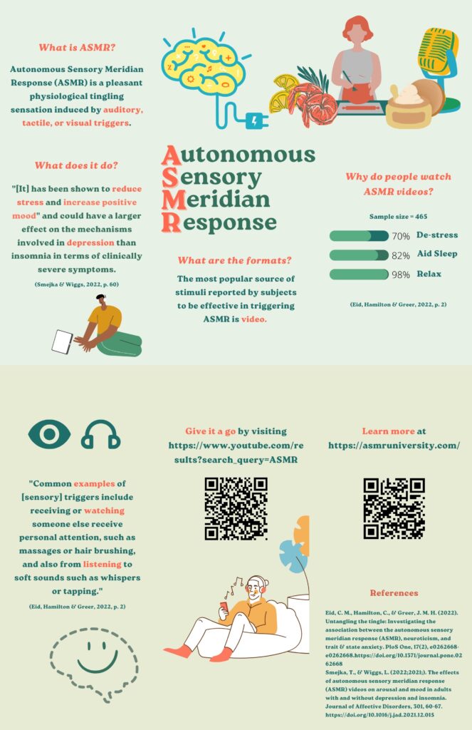
This infographic brochure modified one of the brochure templates on Canva and laid out key points about ASMR. People mainly watch ASMR videos for relaxation, which signifies its function. 

Optional: there is a wide range in terms of the content of ASMR videos, take a moment to dive into some other examples listed below (remember to put on your headphones):

Chocolate chopping

Handwriting

Soap sculpting

Turtle eating food

Implementing multimedia learning theories

I have included both news articles and YouTube videos to help explaining the concept of ASMR, and that brings

The infographic brochure (with two pages merged together) primarily followed the Spatial Contiguity Principle as relevant texts and images are closely put together for audiences to have a better understanding of the content. It has a logical order that helps the audience to grasp the idea of ASMR and then have chances to try and/or learn more from the given links and QR codes, thus, it is interactive. The Segmenting Principle is shown when different parts are divided into questions using eye-catching colours. In addition, while designing this brochure, emphasis is presented when the highlighted keywords are in a contrasting colour against the background colour in order to gain attention and enhance the audience’s memory. To be specific, the theme colour is green and the important information used its contrasting colour on the colour wheel, orange. Last but not least, “white space” is shown so that the viewers will not be overwhelmed. 

Following these will help students from general to specific, learn more about ASMR and have chances to have hands-on/in-person experiences. 

Conclusion

We have included videos, texts, and infographic posters/brochures to facilitate our blog content. It is already a valuable learning experience creating multimedia artifacts, the primary learning outcome we gained after taking this course. These types of multimedia elements can build effective understandings for learners as it provides chances for hands-on experiences. Similar method can be used in other instructive materials (e.g., first aid techniques or magic tricks) enhancing students’ memory.

References

Davis, G. & Norman, M. (2016, July 19). Principles of multimedia learning. Retrieved from: https://ctl.wiley.com/principles-of-multimedia-learning/

Loew, I. (2021, April 28). The 13 principles of design & how to apply them. Retrieved from: https://paperform.co/blog/principles-of-design/#5-proportion

Keiles, J. (2019, April 4). How A.S.M.R. became a sensation. www.nytimes.com. Retrieved from: https://www.nytimes.com/2019/04/04/magazine/how-asmr-videos-became-a-sensation-youtube.html 

Redundancyprinciple. YouTube. (2018, May 31). Retrieved June 22, 2022, from https://youtu.be/_qz9cIaWOhw

The coherence principle. YouTube. (2018, October 30). Retrieved June 22, 2022, from https://youtu.be/PTyr9P15JhI

The signaling principle. YouTube. (2017, October 23). Retrieved June 22, 2022, from https://youtu.be/ENGjwO-kKpc

YouTube. (2018, March 27). Personalization principle dr Richard Mayer. YouTube. Retrieved June 22, 2022, from https://www.youtube.com/watch?v=EYIatC92JhU

8 basic design principles to help you make Awesome Graphics. (n.d.). Retrieved June 6, 2022, from https://www.adobe.com/express/learn/blog/8-basic-design-principles-to-help-you-create-better-graphics

10-minute meditation for Beginners. YouTube. (2020, August 15). Retrieved June 22, 2022, from https://youtu.be/U9YKY7fdwyg

Week 6 Feedback-Judy’s Post

Hi Judy! Thank you so much for sharing your video! You clearly laid out the learning theories that you followed. One thing I especially realized is the transitions you updated/incorporated in your imovie video vs what you had in your screencast! I also noticed your use of the redundancy principle which stood out to me because in your screencast video I felt there was a lot going on, and depending on the type of learner you have, that could be considered distracting. Therefore, by cutting out bulks of text and just choosing narration along with visual aids made the video much easier to follow. For example, our eyes could follow the visuals while our ears listened to narration; rather than our eyes trying to follow both images and text. Overall, really well done and thank you for sharing!

Blog #6

PROMPT: Describe differences between TPACK, SAMR and SECTIONS

TPACK stands for Technological, Pedagogical, and Content Knowledge. I believe this means they are all about knowledge. Whereas SAMR is Substitution, Augmentation, Modification, and Redefinition, which involves the focus on educational technology. Finally, SECTIONS, stands for Students, Ease of Use, Costs, Teaching Design, Interaction, Organizational Issues, Networking, and Security and Privacy. I believe that SECTIONS is about the overall usage for students and the opportunity it allows educators to provide to their students. The main difference I found between the three is TPACK if focussed on the knowledge and content of what the students are learning, SAMR is focused on the technology used for the student, and SECTIONS is focused on the impact all of this will have on both the student and the educator.

As stated in Bate’s video, SECTIONS and SAMR work very well together for students and educators. This could be because as stated in my paragraph above, SAMR focusses on technology education and SECTION focusses on the impact the resources have on the students. Therefore, if we carefully review the technology we choose to use, then use SECTIONS to finalize our analyzation and to consider how it will impact our students and if it will be beneficial, we can then decide whether the technology is worth keeping.

Resources

7. choosing media. YouTube. (2020, April 23). Retrieved June 19, 2022, from https://youtu.be/-W79hGvukTs

Feedback to Judy’s Post

Hi Judy! Very well done on your blog this week! You clearly identified the importance of inclusion and diversity for all learners. As a summer camp leader, I can vouch this is extremely important to not get the learner ready to learn, but to get the instructor and education ready for the learner. As you mentioned through the backward design video, educators must plan with care and understanding to the fact that everyone learns differently. Although I agree that the teaching step is most valuable, I was just curious when you say that because doesn’t the planning aspect have a big role into the teaching aspect? Overall, well done I enjoyed reading your post! Thank you for sharing 🙂

Blog Post #5

The Importance of Accessibility, Inclusion, and Adaptation

Image Retrieved from https://www.ascension-lift.com/blog/schools/3-steps-accessible-classroom/

Inclusion of all students is extremely important, especially when it comes to learning. When it comes to learning, resources should be accessible and beneficial for ALL students, including those with extra needs or disabilities. This means that often schools and teachers must adapt their typical style of education for preparation of these students with alternative needs, to ensure they will be successful as well. British Columbia’s A guide to adaptations and modifications (2009) states examples of adaptations such as “alternatives to written assignments to demonstrate knowledge and understanding”. By providing options for the student to choose from, the student will then be able to demonstrate their understanding of a topic in the best way they know how to. For example, if you give options for assignments such as a writing assignment, a creative assignment, or a verbal assignment, students now have 3 options which they could use to demonstrate what they have learned to you. By creating these options, it also allows students to choose their assignment based on the resources that they have accessibility to at home. This is important because not all students have access to a computer at home. Therefore, if schools were to assign an online assignment it would be extremely important for them to provide access to school computers; this way all students have the resources required to complete the assignment.

Backward Design

Video retrieved from Youtube

In this video “What is Universal Design for Learning (UDL), they breakdown that not everyone learns the same and gives the example that it is like asking everyone to fit into one size of clothing. This is clearly not how life works. Then they describe UDL as an “education framework that guides the design of learning goals, materials, methods, and assessments”. By allowing options for learners, we can help to increase the success of all students. Similarly to the video “Backward Design“, they state the three main steps: identification, evidence, and planning. As a camp leader, I can vouch that these steps are incredibly helpful to guiding my campers to success. For example, in camp, if we are having behavioural issues with a child, we will use this backward design method to teach what is considered “good behaviour” and prevent the “bad behaviour” from happening in the first place. As a camp leader, I recognize that just saying “no” does not work for everyone. This is due to the fact that everyone learns and adjusts to situations differently. Therefore, I use a Positive Behaviour Support System (PBS) to model what I want to see. The backward design method is actually inherited into the PBS system that I follow. First, I will identify the goal I have for the child/the behaviour I want to change. Second, I will use evidence (such as encouraging what I want to see) to ensure the camper has understood what I want ; I know this when they continue to model the behaviour that I am encouraging. Third, I will plan ahead to prevent the behaviour from happening in the first place. For example, by using gentle reminders such as “before we go inside, remember to use walking feet” or such, therefore the camper knows my expectations of them. Another option I often use is providing visuals. Many people, especially children, do not respond well to verbal cues or direction and require visuals. Therefore, by having images with my rules and expectations, campers can see exactly what they are supposed to do. By providing these visuals, it demonstrates the utilization of UDL because it gives all my campers who learn differently different ways to try to understand the expectations. For those who are verbal learners, they will get verbal reminders and also for those who are visual learners they can see exactly what is meant by my verbal direction with the images provided.

Resources

Adaptations and modifications guide – burnaby schools. (n.d.). Retrieved June 19, 2022, from https://burnabyschools.ca/wp-content/uploads/2014/09/adaptations_and_modifications.pdf

BC Ministry of Education http://udlresource.ca/2017/12/backward-design/

Promoting accessible classroom – ascension wheelchair lifts. Ascension Wheelchair Lifts – ADA Compliant Wheelchair Lifts. (2021, June 4). Retrieved June 18, 2022, from https://www.ascension-lift.com/blog/schools/3-steps-accessible-classroom/

What is Universal Design for Learning (UDL)? YouTube. (2017, November 2). Retrieved June 18, 2022, from https://youtu.be/AGQ_7K35ysA

ASSIGNMENT 3: UPDATED MULTIMEDIA !

See below for my previous and updated version of my posters and my reasoning for changes.

PREVIOUS POSTER:

Previous Canva poster designed by me

UPDATED POSTER:

Updated Canva poster designed by me

For this assignment, I have decided to update my Canva poster on Victoria B.C. to further reflect my understanding and knowledge of the multimedia learning principles.

The very first thing I updated before anything else was the layout/template. I found that although my first poster may have been aesthetically pleasing to the eye, it lacked informative details and reasoning to visit Victoria BC. This was because the first layout did not give me enough room to add more text. The second thing I changed was placement of the heading “VICTORIA BC”. In my first poster the heading was closer to the middle of the page on the very left side of my poster. However, this was not the most efficient for my customer segment or learners who are reading my poster. In the video “What makes a good infographic” they state that infographics are considered well done when the information/story flows as you scroll through the page. I believe this is similar to a poster because in majority of North America, our eyes work by reading from left to right and up to down. Therefore, by having “Victoria BC” centred at the top of my poster, it will leave no room for my readers to assume what my poster could be about. To add to this, I changed the font of “Victoria BC” because I felt that the new font I used was better suited to represent Victoria in a fun, unique and beautiful way. This relates to the “Design and Layout with Canva” video, where fonts stand out to a reader to add to emotion/set the mood and tone. Another thing I updated was adding descriptions to each of the recommended hidden gems. I did this because although the photos are very beautiful, it does not say much about what to expect, nor does it give a location, whereas my updated poster does include these details. The next update I made was presenting my information using the “personalization principle”. For example, I asked the question “Why should you visit?”, which is both conversational/engaging to the reader. This is significant because according to Richard Mayer’s video on “personalization principle”, people often take in information better when it is presented in first person language. Another principle I took into consideration was the coherence principle, in which I removed the flower in the corner of the poster, which could’ve been considered distracting, and I kept the photos of each “hidden gem” under the topic and then provided a mini description of each. This could allow my reader to take in the information I am providing because according to the youtube video on “The Coherence Principle”, people learn better when “extraneous material is excluded rather than included, when cues are added that highlight the organization of the essential material, and when corresponding words and pictures are presented near rather than far from each other on the screen or page”.

These were the main changes/updates I made to further demonstrate my understanding on these principles. Some things I did keep the same such as following Adobe’s 8 principles of design: alignment, hierarchy, contrast, repetition, proximity, balance, colour and space. I especially kept my colour combination of baby blue, white, and black the same because I felt the baby blue really brings out happiness and a sense of security when looking at the poster, reflecting how I feel about Victoria BC.

References

Design and layout with CANVA – youtube. (n.d.). Retrieved June 13, 2022, from https://www.youtube.com/watch?v=g3pdyid7BjU

How to create an infographic – part 1: What makes a good … – youtube. (n.d.). Retrieved June 13, 2022, from https://www.youtube.com/watch?v=nLxQAa5Sras

8 basic design principles to help you make Awesome Graphics. (n.d.). Retrieved June 6, 2022, from https://www.adobe.com/express/learn/blog/8-basic-design-principles-to-help-you-create-better-graphics

https://youtu.be/EYIatC92JhU

youtu.be/PTyr9P15JhI

Week 4 – Feedback to Judy’s Poster

Hi Judy! Very well done on your poster this week! I love all the visuals as they easily catch the attention of any reader/learner! You easily have a balanced amount of visuals such as images, as well as text, where it is not too lengthy that the learner would get bored of reading it! Well done! I can also see that you clearly followed Adobe’s 8 principle elements of design, especially with your colour and contrast choices! The light blue and beige go perfectly together, while not overpowering one another. One thing I would consider thinking about is if the pattern/image choice at the top of the poster, as well as the different images/shapes separating each section, could be found a bit distracting for the reader? Overall, good work! I really enjoyed your poster 🙂

Week 4: Design of Multimedia Learning- Objects and Artifacts

Canva poster created by me

This week I discovered Canva and created a poster using it. While creating this poster on my hometown, Victoria BC, I found Canva very easy to use. Once I made an account, I could choose from templates for my poster and edit/design it as I liked. Although I did not design an informative educational poster, I still followed the 8 basic principles of design: alignment, hierarchy, contrast, repetition, proximity, balance, colour, and space. I particularly found colour and spacing extremely important while creating my poster. As my “customer segment” would be adventurous people who live in Victoria or tourists who are visiting, I ensured to include photos as well as “bright and happy” colours to catch the viewers eye. I feel by using the template that I did, it was easy to read and follow. By choosing a white background with blue as my main pop of colour on the poster, I feel the blue could make people feel “calm or trusting” (Adobe, 2020). Overall, I found by using Canva, my graphic design abilities have improved and my understanding of the basic design principles. As Adobe (2020) states “developing an eye for visuals starts with identifying these basic design principles.” For more information, visit the adobe website at https://www.adobe.com/express/learn/blog/8-basic-design-principles-to-help-you-create-better-graphics.

References

8 basic design principles to help you make Awesome Graphics. (n.d.). Retrieved June 6, 2022, from https://www.adobe.com/express/learn/blog/8-basic-design-principles-to-help-you-create-better-graphics

Week 3 Feedback- Judy’s Post

Hi Judy!

First of all thank you for sharing!

I can clearly see that you are discussing the constructivist and socio-constructivist teaching methodology approaches of working alone vs working in groups. I agree with you that the socio-constructivist teaching methodology approach is extremely important in learning because of its interactiveness which allows a students imagination and creativity to grow while staying educated! With this being said, I wonder if the socio-constructivist teaching methodology and gamification go hand in hand? You also strongly explained the difference between gamification and game based learning!

I also found it nice that you pointed out what you misinterpreted in learning too! I think this is extremely important and beneficial to people to see that even “teachers” can make mistakes too!

Thank you for sharing! Well done!

WEEK 2 BLOG POST: HOW DO WE LEARN?

Prompt:

  1. Examples you have been a part of in your classes of Game Based Learning
  2. Examples you have been a part of in your classes of Gamification

In this week’s blog post, I am going to talk about my experience of game based learning and also my experience in creating gamification in the workplace.

First, I will talk about an example I have been a part of in my classes of Game Based Learning. In my grade 8 science class, my teacher encouraged Game Based Learning in her classroom. For this assignment, we were required to either write a song on the topic, or create a game to do with the topic. I clearly remember creating a board game for my class and having to be able to explain the game clearly for all my fellow classmates. I found this difficult because it allowed me to realize that just because something made sense to me, it did not necessarily mean it made sense to my classmates. Therefore, I ensured that my game was accessible for all, as well as that it helped everyone retain and understand the content needed for our test. In our board game, we were required to incorporate certain definitions and gain or lose points based on the learners understanding/answer. For my board game, I created a game similar to monopoly where each property was a definition and each chance card required answering questions about the definition. I found this interactive learning style of Game Based Learning extremely helpful in understanding and retaining information!

Photo retrieved from University of Waterloo

Secondly, I am going to talk about my experience in creating Gamification in my workplace. As a summer camp leader, although we are not educating all the campers in an academic way, we still used Gamification to encourage and motivate our campers. As most of our campers varied in age but fell in the younger ages, we used teams and point systems to encourage and help teach good behaviour. For example, each week we would separate our campers into groups of 5-6 people. This would be their team for the week. Every time the campers played games, or went on out-trips, or helped with cleaning, etc., we would offer points. For example, if a child was positively encouraging their teammate in a game, we would acknowledge their positivity and reward them with a point for their team. We would also take away points for negative behaviours. I found this form of gamification extremely helpful in my work environment as it helped my campers to realize that if they did participate in negative or positive behaviours, the points would not just benefit or consequent them, but their team as well. At the end of the week, the team could choose a prize together using their points. Overall, I found this gamification in my work environment very beneficial to both myself and my campers!

« Older posts