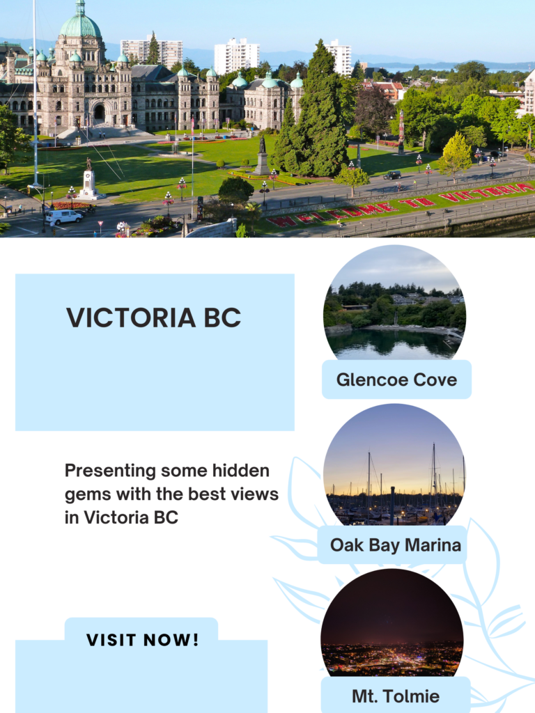
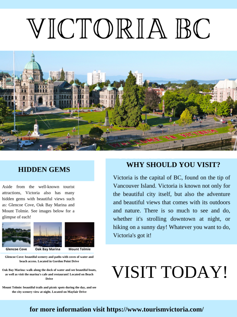
See below for my previous and updated version of my posters and my reasoning for changes.
PREVIOUS POSTER:

UPDATED POSTER:

For this assignment, I have decided to update my Canva poster on Victoria B.C. to further reflect my understanding and knowledge of the multimedia learning principles.
The very first thing I updated before anything else was the layout/template. I found that although my first poster may have been aesthetically pleasing to the eye, it lacked informative details and reasoning to visit Victoria BC. This was because the first layout did not give me enough room to add more text. The second thing I changed was placement of the heading “VICTORIA BC”. In my first poster the heading was closer to the middle of the page on the very left side of my poster. However, this was not the most efficient for my customer segment or learners who are reading my poster. In the video “What makes a good infographic” they state that infographics are considered well done when the information/story flows as you scroll through the page. I believe this is similar to a poster because in majority of North America, our eyes work by reading from left to right and up to down. Therefore, by having “Victoria BC” centred at the top of my poster, it will leave no room for my readers to assume what my poster could be about. To add to this, I changed the font of “Victoria BC” because I felt that the new font I used was better suited to represent Victoria in a fun, unique and beautiful way. This relates to the “Design and Layout with Canva” video, where fonts stand out to a reader to add to emotion/set the mood and tone. Another thing I updated was adding descriptions to each of the recommended hidden gems. I did this because although the photos are very beautiful, it does not say much about what to expect, nor does it give a location, whereas my updated poster does include these details. The next update I made was presenting my information using the “personalization principle”. For example, I asked the question “Why should you visit?”, which is both conversational/engaging to the reader. This is significant because according to Richard Mayer’s video on “personalization principle”, people often take in information better when it is presented in first person language. Another principle I took into consideration was the coherence principle, in which I removed the flower in the corner of the poster, which could’ve been considered distracting, and I kept the photos of each “hidden gem” under the topic and then provided a mini description of each. This could allow my reader to take in the information I am providing because according to the youtube video on “The Coherence Principle”, people learn better when “extraneous material is excluded rather than included, when cues are added that highlight the organization of the essential material, and when corresponding words and pictures are presented near rather than far from each other on the screen or page”.
These were the main changes/updates I made to further demonstrate my understanding on these principles. Some things I did keep the same such as following Adobe’s 8 principles of design: alignment, hierarchy, contrast, repetition, proximity, balance, colour and space. I especially kept my colour combination of baby blue, white, and black the same because I felt the baby blue really brings out happiness and a sense of security when looking at the poster, reflecting how I feel about Victoria BC.
References
Design and layout with CANVA – youtube. (n.d.). Retrieved June 13, 2022, from https://www.youtube.com/watch?v=g3pdyid7BjU
How to create an infographic – part 1: What makes a good … – youtube. (n.d.). Retrieved June 13, 2022, from https://www.youtube.com/watch?v=nLxQAa5Sras
8 basic design principles to help you make Awesome Graphics. (n.d.). Retrieved June 6, 2022, from https://www.adobe.com/express/learn/blog/8-basic-design-principles-to-help-you-create-better-graphics
Recent Comments